


SEJournal Online is the digital news magazine of the Society of Environmental Journalists. Learn more about SEJournal Online, including submission, subscription and advertising information.
September 15, 2021
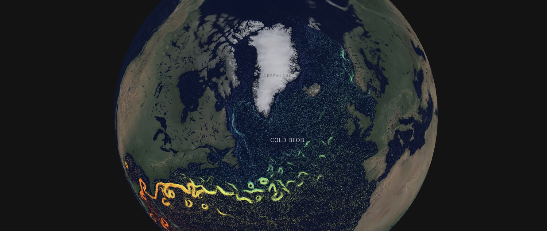 |
| A still frame from the Spring 2021 “In the Atlantic Ocean, Subtle Shifts Hint at Dramatic Dangers” project, which explored alarming changes in ocean currents through intuitive animation. Image: The New York Times. Click to enlarge. |
EJ InSight: Interactivity Advances Environmental Storytelling, Part III — Exemplary Examples
By Joseph A. Davis
One of the best ways to understand interactive journalism is with examples relevant to the field of environmental journalism.
Most of the examples below provide good (if highly selective) models to imitate or learn from. Some won so many prizes that we may not list them all. And the now-outdated convention of principally crediting the person who wrote the words — rather than the entire team of collaborating and contributing specialists — has been (and should be) supplanted by fuller crediting, but we may abbreviate anyway for space.
Publication dates given may reflect the first installment in a multipart series. Enjoy!
“Who Will Pay To Protect Tech Giants From Rising Seas?” — NPR, July 27, 2021, by Lauren Sommer. Of course you have to use flashy interactives to tell the story of how rising seas may affect the Silicon Valley tech giants surrounding the Bay — drone video, maps that react, overlays that scroll forever. But the story gets told well. The fact that it’s done by NPR should remind us how there are no longer many walls between media platforms. This “radio” platform not only leaps distribution barriers, but excels in visuals in ways that few cable nets do very often.
“The Plan to Protect Indigenous Elders Living Under the Northern Lights” — The New York Times, March 11, 2021, by Peter Kujawinski, with photos and video by Pat Kane (may require subscription). Come for the breathtakingly luscious and exciting visuals. Stay for the insightful story about how the remote community of Yellowknife coped with a pandemic, which not only threatened its tourist economy, but also the Indigenous elders who are the repository of its cultural heritage. Sure, it has northern lights — but the other photography somehow captures the unique half-daylight of northern latitudes.
“In the Atlantic Ocean, Subtle Shifts Hint at Dramatic Dangers” — The New York Times, Mar. 2, 2021, by Moises Velasquez-Manoff and Jeremy White (may require subscription). You will never, in your mind’s eye, see the Gulf Stream the same again. This interactive explores the alarming changes in ocean currents (the Gulf Stream is merely part of the Atlantic Meridional Overturning Circulation, a key global heat pump). The observed changes in ocean circulation were geeky science news in many media, but The Times interactive translated that into intuitive and scary animations that make climate change real and easier to understand.
“Where Will Everyone Go?” — ProPublica, July 23, 2020, by Abrahm Lustgarten with photography by Meridith Kohut. This project was really a collaboration between ProPublica and The New York Times Magazine, with support from the Pulitzer Center. We are used to climate models as predictive imitations of global atmosphere. But this project enlisted geographer Bryan Jones to build a computer model of the human migration that could result from climate change. Of course, the resulting scenarios and maps were presented through great graphics. But they were given a sense of concrete reality by Kohut’s photos, and readers were urged toward a deeper understanding of climate refugees by Lustgarten’s wise, incisive reporting and writing.
“How Decades of Racist Housing Policy Left Neighborhoods Sweltering” — The New York Times, Aug. 24, 2020, by Brad Plumer and Nadja Popovich, with photographs by Brian Palmer (may require subscription). This piece proves that interactives can brightly illuminate the most serious of journalistic topics in ways that words alone could probably not do. It uses data — and especially maps — to show how redlining and other racist housing and development policies led to a tree-deprived and concrete-smothered landscape that forced low-income and minority people to bake in cruel and unjust heat.
“See How the World’s Most Polluted Air Compares With Your City’s” — The New York Times, Dec. 2, 2019, by Nadja Popovich, Blacki Migliozzi, Karthik Patanjali, Anjali Singhvi and Jon Huang (may require subscription). You really want to blink your eyes and clear your throat when you see floating gnat-like on your screen the animated particle pollution PM 2.5. What’s more, the story, when it knows your location (it probably does) tells you how bad your air is compared to, say, a California wildfire zone or New Delhi. All this is combined with some animated maps (see the dust storms!) and excellent explanatory writing.
“2°C: Beyond the Limit” — The Washington Post, Sept. 11, 2019, by Chris Mooney and John Muyskens, with photos and videos by Carolyn Van Houten. This package explored what global warming of 2°C (a red line defined by the Paris accord) might mean in terms of its human impact — on fisheries, lakes, rivers, forests and outdoor workers. It accomplished the difficult achievement of making meaningful use of the vast universe of climate data that scientific instruments have collected, especially by mapping the hot zones. It got an award from the Society of Environmental Journalists along with its Pulitzer.
“Sin Luz: Life Without Power” — The Washington Post, Dec. 14, 2017, by Arelis R. Hernández, Whitney Leaming and Zoeann Murphy. The profound destruction of Puerto Rican infrastructure, unacknowledged mass death and personal hardship wrought by Hurricane Maria in September 2017 is a story still being told. But The Post’s interactive, published a few months later, while the power was still out, added knowledge of a disaster relatively ignored by the administration and too many of the news media. It is told in a very documentary multimedia style — with actual voices in audio and video. You feel it when videos are shot in near-dark. Drones help communicate the disaster’s scale like nothing else can. And you can click for Spanish. It won second place in World Press Photo’s 2018 Digital Storytelling Contest.
“Hell and High Water” — ProPublica and Texas Tribune, March 3, 2016, by Neena Satija for The Texas Tribune and Reveal; Kiah Collier for The Texas Tribune; and Al Shaw and Jeff Larson for ProPublica. Interactives aren’t necessarily prophetic. But this one was. It explored what would happen if a really big hurricane hit Houston. And then, in August 2017, Hurricane Harvey devastated Houston and other parts of the Gulf Coast with unprecedented rain and flooding. This one should win the non-existent “I Told You So Award” for environmental journalism. It used historical hurricane data to create and animate annotated maps. And reminded us that collaboration can be awesome.
“The Outlaw Ocean” — The New York Times, July 25, 2015, by Ian Urbina (may require subscription). This piece, one of the earlier big achievements in interactives, tells the story of lawlessness on the high seas, revealing that crime and violence in international waters often go unpunished. It really broke the story of slavery (may require subscription)in the fishing industry that the AP went on to document more deeply in its own prize-winning package. It became a book and helped establish The Times’ leadership in the interactive arena.
“Snow Fall: The Avalanche at Tunnel Creek” — The New York Times, December 13, 2012, by John Branch. This interactive was one of the earliest full-blown examples of the genre. It tells the story of a 2011 avalanche through multiple characters’ perspectives and using live-witness video and great historical photo research. It won a 2013 Pulitzer as well as a Peabody award. And it positioned The New York Times as a leader in a movement of interactive journalism that was hardly established.
[Editor’s Note: In Part I of this package, read how interactivity transforms environmental storytelling. Plus, in Part II, an interview with Hannah Fairfield, climate editor for The New York Times.]
Joseph A. Davis is a freelance writer/editor in Washington, D.C. who has been writing about the environment since 1976. He writes SEJournal Online's TipSheet, Reporter's Toolbox and Issue Backgrounder, and curates SEJ's weekday news headlines service EJToday and @EJTodayNews. Davis also directs SEJ's Freedom of Information Project and writes the WatchDog opinion column.
* From the weekly news magazine SEJournal Online, Vol. 6, No. 32. Content from each new issue of SEJournal Online is available to the public via the SEJournal Online main page. Subscribe to the e-newsletter here. And see past issues of the SEJournal archived here.
SEJ Publication Types:
Topics on the Beat:
Region:
Visibility: