


SEJournal Online is the digital news magazine of the Society of Environmental Journalists. Learn more about SEJournal Online, including submission, subscription and advertising information.
November 17, 2021

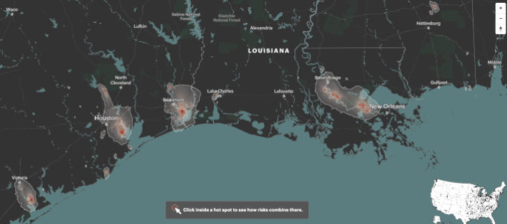 |
| A screenshot from ProPublica’s “Sacrifice Zones” special report, which maps cancer-causing industrial air pollution. Image: ProPublica. Click to enlarge. |
Reporter’s Toolbox: Mapping Toxic U.S. Hotspots Down to the Neighborhood Level
By Joseph A. Davis
Toxic air (and other) pollution causes a huge health and disease burden in many areas of the United States. It’s not just cancer — although that’s the big one. It could be asthma, birth defects, neurological disorders and many other diseases.
So we are glad to report that environmental journalists no longer have an excuse to ignore the toxic hotspots that put people at risk. The mavens at ProPublica have given us “Sacrifice Zones: Mapping Cancer-Causing Industrial Air Pollution,” a shiny and powerful new tool that makes it almost easy.
First, major major props are due to the ProPublica team (too large to list here) who worked for two years putting it together. It’s a multipart report, including the mainbar, “Poison in the Air,” a map of cancer-causing industrial air pollution and how it was created, and a look at the cancer risks of air pollution, plus a journalist’s guide to reporting on nearby toxic hot spots.
Almost anybody can use it. Toolbox would like to mutter geeky things to impress you, but we really don’t have to. It’s there for you to use and largely explains itself. This matters most to journalists writing for an audience close to one of the many toxic hotspots in the United States. If you can smell a refinery from your office, that means you.
Where the data comes from
It does not take away from the ProPublica team’s achievement to note that most of its data (and the foundational tools for dealing with it) has been around for many years. Underneath it all is the Toxics Release Inventory, or TRI, which Congress authorized in the 1986 Emergency Planning and Community Right-to-Know Act, also known as EPCRA, and which first went online in 1989.
TRI requires companies to report annually if they release certain hazardous chemicals above certain amounts to air, water or land. There’s more to the story, but TRI has been the foundation of many other U.S. Environmental Protection Agency data tools in the years since.
Nobody ever said TRI was
easy to use or interpret. …
ProPublica has fixed that.
Nobody ever said TRI was easy to use or interpret. But EPA over the years added layers of further understanding.
One key was a model called risk-screening environmental indicators, or RSEI, which mashed up TRI data with further data or assumptions about ambient exposure, toxicity and the demographics of the people exposed.
Another was a tool called EJSCREEN, which overlaid the data on toxic exposure with demographic data on vulnerable populations — and mapped it. It became a handy environmental justice tool (hence the “EJ”).
EPA did all this, but the data was still awkward and difficult to use for most people. ProPublica has fixed that.
Using the data smartly
Toolbox suggests you start exploring by going to the map to navigate to some localities or regions of special interest to you or your audience. It’s intuitive. You can move around on the map by using the grabber tool or by zooming out and in. You can search by address, zip code or city. You can search for a facility name.
When you find a facility or area of interest to you, you can dig in deeper. The interactive map tells you what toxics are in the air and how much that pollution affects your odds of getting cancer. Separately, it has a rigorous explainer about what is and isn’t known about the connection between air pollution and cancer.
The ProPublica team offers a thorough set of recommendations about what you can and can’t conclude from the data. It wisely makes clear that no data can be assumed to be perfect.
Once you have information from
the map, it reminds you, the job
of reporting has just begun.
Once you have information from the map, it reminds you, the job of reporting has just begun.
It lists the steps. You need to check the data. You need to get and look at the documents. You need to talk to state and local agencies, plant managers and employees, and neighbors and local health facilities. You need to check the permits of the plant and look up their violation and enforcement record. You need to find any available air quality monitoring stations. You need to look up the most recent data.
In short, you need to verify everything.
Like any good data journalism project, the ProPublica map documents in thorough detail how it built its presentation on a technical level.
A few final warnings. The ProPublica map project focuses on air pollution, leaving out other kinds of pollution (like water pollution) that are relevant to health. Also, it is limited largely to cancer as a health consequence, leaving out many other health effects (like asthma, respiratory disease, birth defects, etc.).
But its strengths far outweigh its limitations. The graphics are stellar — you can see facilities and neighborhoods as labeled aerial photos. The resolution is incredibly fine; each of its grid squares is just 810 x 810 meters. Not slow and clunky like EPA’s map apps, it is snappy and responsive. Everything is well labeled — not just the chemical plants but also the nearby elementary schools.
[Editor’s Note: For an in-depth tutorial on how to investigate toxic air pollution in your neighborhood by using ProPublica’s first-of-its-kind air toxics map and data, join a virtual event co-sponsored by SEJ and ProPublica on Monday, Nov. 22, 2021, 3-4p.m. ET.
Plus, SEJournal has published many Toolboxes and TipSheets on using TRI over the years. See “Early Toxics Release Inventory Data Can Yield Scoops,” “Toxic Chemicals Data Can Inform Your Community of Risks,” “Toxics Database a Key Tool for Environmental Journalists,” “TRI National Analysis Dangles Leads for Investigative Stories” and “Use EPA TRI Database To Find Toxic Threats.” Also check out our recent WatchDog Opinion column, “A Chance To Widen Public Information About Chemical Hazards”.]
Joseph A. Davis is a freelance writer/editor in Washington, D.C. who has been writing about the environment since 1976. He writes SEJournal Online's TipSheet, Reporter's Toolbox and Issue Backgrounder, and curates SEJ's weekday news headlines service EJToday and @EJTodayNews. Davis also directs SEJ's Freedom of Information Project and writes the WatchDog opinion column.
* From the weekly news magazine SEJournal Online, Vol. 6, No. 41. Content from each new issue of SEJournal Online is available to the public via the SEJournal Online main page. Subscribe to the e-newsletter here. And see past issues of the SEJournal archived here.
SEJ Publication Types:
Topics on the Beat:
Region:
Visibility: