


SEJournal Online is the digital news magazine of the Society of Environmental Journalists. Learn more about SEJournal Online, including submission, subscription and advertising information.
January 3, 2024
 |
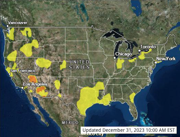 |
| Government data can be put to good use by news organizations, such as that from the multi-agency AirNow project behind this daily air quality forecasting map. Image: AirNow.gov. |
Reporter’s Toolbox: Environmental Digital Storytelling — A Best-in-Show Sampler
By Joseph A. Davis
As print news declines, online journalism is still having its growth spurt. And since the last time this writer praised digital journalism “interactives” two years ago, a lot of important work has been published online, telling stories in ways more effective than plain (often gray) print.
So, here’s an update.
First, an aside: We originally set out to compile a list of the snazziest interactives in the last year or so. But Toolbox quickly realized that “snazz” by itself (or just data by itself) is often hollow. It’s about more than data journalism.
What really matters is the journalism that … matters to people. And we still think this set of tools is ideally suited for telling people important stories about the environment.
Proving our point (even though it’s an older effort) is ProPublica’s landmark project, “Sacrifice Zones.” It mapped graphically and in granular detail the amount and injuriousness of toxic chemical releases in the United States.
The project used data that was already available from the U.S. Environmental Protection Agency — but presented it more meaningfully and effectively than any agency or media outlet had done before. The large and talented team followed up the data, telling some important stories about its consequences (e.g., reporting and explaining the environmental justice consequences).
Mapping depleted aquifers, visualizing vanishing culture
Another example: The New York Times showed how perfectly interactives can fit environmental stories with its recent “Uncharted Waters” series about the depletion of U.S. groundwater.
Aquifers, of course, are supremely mappable. But the Times team went well beyond the maps to investigate the laws and rules on groundwater in all 50 states. And its relation to fracking and french fries. And the powerful players that control groundwater and block change.
Meanwhile, The Associated Press has for some time been a leader in visual journalism — but until recently it has suffered from its classic, somewhat strait-laced “just the facts” data philosophy. No more.
Look at what the AP did with two stories about sheep herding and Navajo cultural traditions. It’s not about data at all; it’s about people and culture. And what brings it to life is the excellent photographs by John Locher. It’s a reminder that what sings online is not just data-based interactives, but rather “multimedia journalism.”
The importance of persistence
Yet data journalism with that “just the facts” approach can be momentous. No snazz; just dogged reporting and hard work.
So we admired the AP’s massive project on U.S. dams in 2019. Not only did the AP team penetrate the Corps of Engineers’ veil of semi-secrecy about dam safety data, but it used the data to reveal widespread safety failures.
At the time, by collaborating with AP partner media, it helped generate stories in many places. Then, by following up in May 2022 to see what effect its original story had had (not enough safety improvements), and more recently in a look at the New England region in fall 2023, it also demonstrated the importance of persistence.
When Easterners in New York, D.C. and other places woke up to orange skies during Canadian wildfires in mid-summer 2023, The New York Times (naturally) published a really good smoke map. We have come to expect that. It’s to the Times’ credit that their programmers rigged the map so that it updates automatically, and is still doing so every day.
Government data sources sometimes
are quite relevant and helpful
to the public, and journalists can
make use of these opportunities.
It’s also noteworthy that the multi-agency AirNow is the source of the data. Our point is that government data sources sometimes are quite relevant and helpful to the public, and that journalists can make use of these opportunities when they occur. In fact, several other outlets have done similar work (e.g., USA TODAY and ABC News).
While malaria doesn’t much trouble media hubs like New York and D.C., The Washington Post took us to sub-Saharan Africa, with its timely and spectacular October 2023 interactive mapping incidence of malaria worldwide.
Sure, it was a snazzy interactive. But two of the team of more than 13 who produced it traveled widely in Mozambique to report it. They didn’t just use data — they used three different computer models to envision future malaria incidence in a warming world. The rotatable global map was cool (and, more importantly, effortlessly illuminating). But the deeply human photos were worth the price of admission. The piece was part of the Post’s larger “The Human Limit” series.
Haunting, spectacular visuals
Reuters also expanded our world with its November 2023 multimedia masterpiece about the impact of climate change on Japan’s 1,300-year legacy of fishing with small trained cormorants.
We must note that it involved no “data” in the digital sense. But the visuals were as spectacular and haunting as the textual reporting. Kim Kyung-Hoon did both the photography and the reporting. Or maybe the photography was the reporting. The project was part of Reuters’ “The Wider Image” series.
Equally impressive was the AP interactive on the dried-up Aral Sea, once the world's fourth-largest inland body of water. No “data” here, either. Just storytelling with photos.
Good stories usually have characters. So the AP went to Uzbekistan and produced a series of great photos of aging fishermen, in traditional dress, who had once fished the Aral Sea — posed against the rusting, high-and-dry hulks of their former boats. AP says it’s just the beginning of a larger series on the Aral.
Interactives were also part of the AP’s multimedia series entitled “The Protein Problem,” about the challenge of feeding the world’s people as the Earth warms. If you don’t have time for the whole series, just check out the piece on aquaculture (which itself has multiple “chapters”). People eat more farmed fish than wild fish.
Again, the story wasn’t just data. AP sent its team to visit “aquaculture villages” in Indonesia. With masterful balance, they explored how aquaculture is more sustainable than, say, raising beef. But they also explored how aquaculture is vulnerable to water pollution — as well as sometimes causing it.
[Editor’s Note: For more on digital environmental journalism’s potential, see a three-part EJ InSight package from writer Joseph A. Davis, with Part I on how interactivity transforms environmental storytelling; Part II, an interview with Hannah Fairfield, climate editor for The New York Times; and Part III, a list of model projects that set the standard for interactivity in environmental journalism.]
Joseph A. Davis is a freelance writer/editor in Washington, D.C. who has been writing about the environment since 1976. He writes SEJournal Online's TipSheet, Reporter's Toolbox and Issue Backgrounder, and curates SEJ's weekday news headlines service EJToday and @EJTodayNews. Davis also directs SEJ's Freedom of Information Project and writes the WatchDog opinion column.
* From the weekly news magazine SEJournal Online, Vol. 9, No. 1. Content from each new issue of SEJournal Online is available to the public via the SEJournal Online main page. Subscribe to the e-newsletter here. And see past issues of the SEJournal archived here.
SEJ Publication Types:
Topics on the Beat:
Visibility: